Responsive design offers a great solution for those people who do not have a full mobile version of their website ready. With ecommerce it is extremely important that as many people as possible can see and buy your products. After all that is why your site is there. There is nothing worse than having to struggle to use a website on an iphone. At a very minimum your customer should be able to buy from a mobile device. Why would you try and stop them?
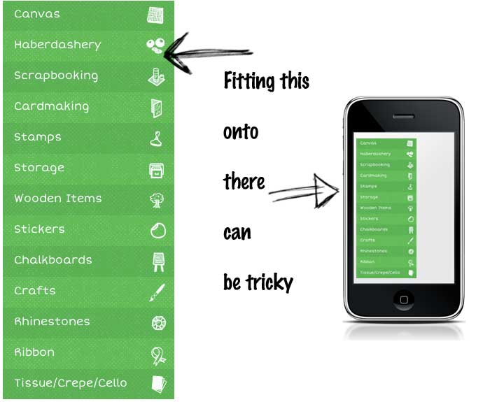
One of the biggest challenges we have come across when building responsive websites is how to deal with the navigation. Often on an ecommerce site we have as many categories as possible spread out across the primary navigation. This helps the shopper find more quickly what they are looking for but at the same time it makes it very hard to squeeze it into 320px screens.
Here are three simple solutions to the responsive navigation problem. To help us illustrate what we mean we are going to pretend we the following main categories.

With any of the following techniques you must provide the solution within the page and hide it using CSS. Media queries used by responsive design do not provide a way to programatically add page elements as the sizes change. All we can do is show and hide elements with css. This has implications for the complexity of the solutions as we don’t want to increase the page load sizes too much or complicate the site in a way that impacts the users of the other devices.
With responsive design only one page is served regardless of the device so android phone users get the same code base as someone looking at the page in chrome on OsX. It is the code base that adapts the UI based on the device pixel size.

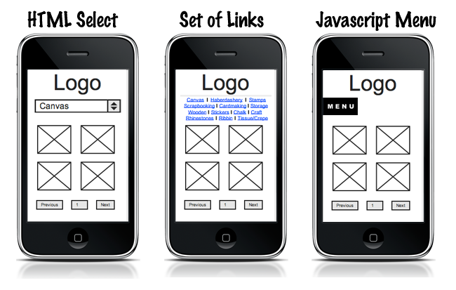
1. Make the navigation a HTML select box
This one is so simple it probably slipped your mind. After all we all stopped using selects for navigation on web sites years ago right? Well this is mobile and we think it makes perfect sense when trying to solved the responsive design navigation problem. No explanation is required as we are all familiar with the select box. Put simply just convert your pixel-hogging mega navigation into a simple select.
Pro’s: lightweight, no learning required Con’s: one extra click to category pages, navigation moves as we scroll
2. Turn it into a simple set of inline links
Again another extremly simple solution that works. We are actually reducing the complexity of the page by stripping out the icons and green background.
Pro’s: simple and lightweight, same number of clicks to content as the original, great for SEO. Con’s: potential to use too much space, navigation moves as we scroll
3. Hide and replace with a menu button
This is the most complicated solution and requires a little bit of extra effort. When your screen becomes phone size we hide the navigation and replace it with a small floating Menu button. Let the user click this to reveal the full menu again, but only when they want it. The rest of the time there is no main navigation. This is nice because as the user scrolls the navigation stays on screen.
Pro’s: completely removes navigation from page saving a lot of space Con’s: requires learning, not a commonly used tool. Navigation stays on screen the whole time.
And the winner is …
If you want us to pick a favourite I would have to say give it to the HTML select box. Quick and easy to implement with the added benefit of all your users just ‘getting it’. Use this in conjunction with ‘back to top’ links to save on scroll time when users need to navigate.
If we’ve missed a great idea or you think you could do it better, leave us a comment. We reply to them all.
